
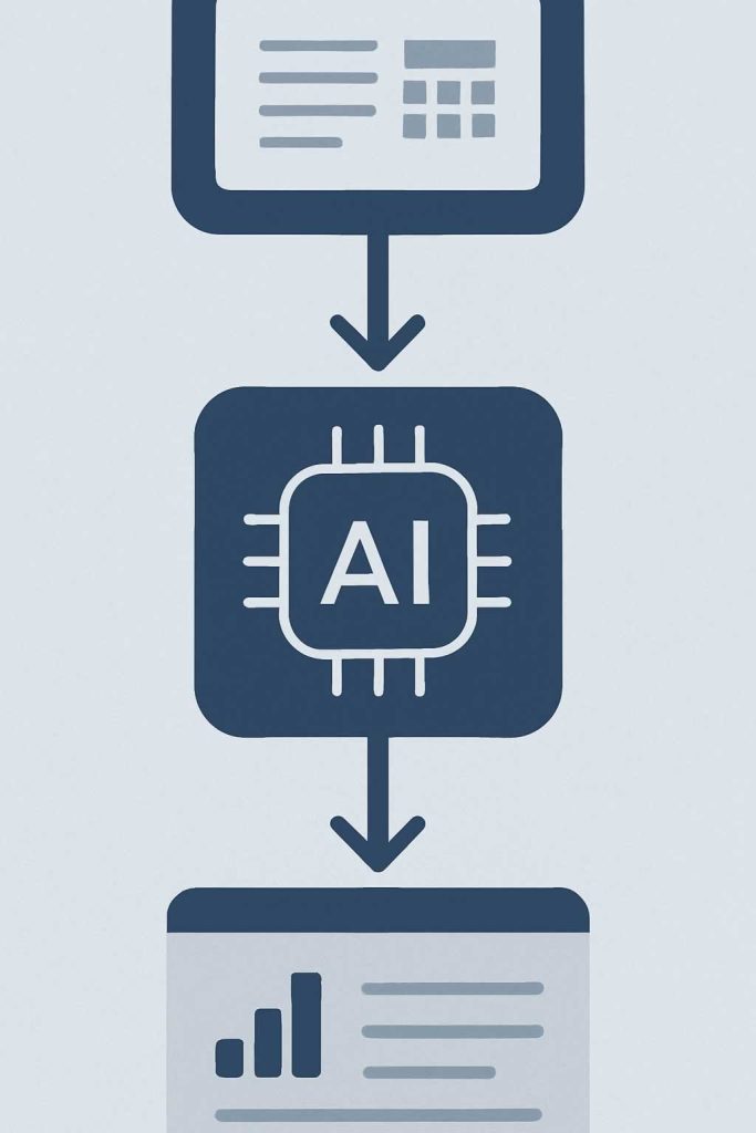
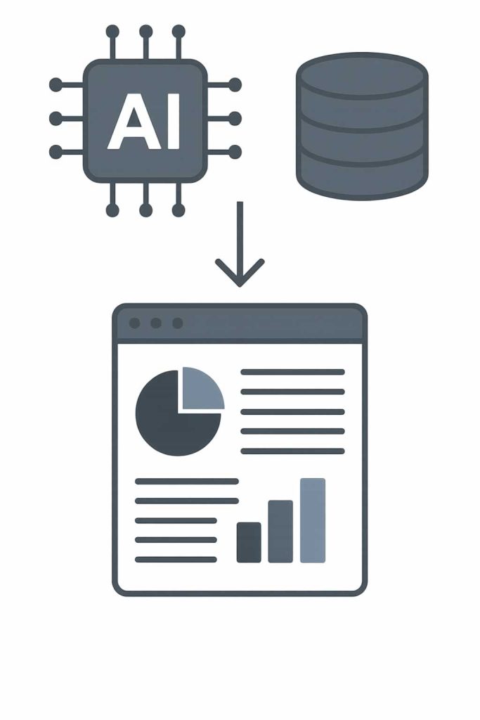
The best tools for visualizing AI results are the ones that make data clear, actionable, and accessible to both technical and non-technical users. At AEHEA, we choose visualization tools based on the complexity of the AI system, the audience we are presenting to, and the type of data involved whether it is classification accuracy, sentiment scores, keyword clusters, or generative model outputs. Visualizing AI results is not just a reporting task. It is how we understand what the model is doing and why it behaves a certain way.
For general dashboards and real-time monitoring, we often use Grafana or Superset. These platforms allow us to connect to databases or APIs and display performance metrics like prediction counts, accuracy over time, latency, or model drift. Grafana is particularly strong when paired with time-series data and alerting systems. We use it in production environments to monitor how AI models are performing under live traffic and how usage trends evolve across workflows.
When we need to present results to clients or teams, tools like Tableau, Power BI, and Looker offer powerful visual interfaces that make complex AI insights easier to digest. These platforms are ideal for building interactive dashboards with filters, visual groupings, and contextual drill-downs. For example, we might show how a recommendation model behaves differently across user segments or how a sentiment analysis engine responds to different product categories. These tools help decision-makers see what the AI is doing without needing to understand the code behind it.
For technical teams and internal exploration, we often turn to Jupyter Notebooks combined with Plotly, Matplotlib, or Seaborn. These let us prototype quickly, test assumptions, and explore output distributions or confidence scores visually. At AEHEA, we also use custom-built dashboards in web frameworks like Streamlit when we need something lightweight and fast. Whether we are visualizing language outputs, image classifications, or time-series forecasts, the goal is always the same: bring AI into human terms so the results are not just accurate, but also understandable and usable.